Top 5 Reasons to Use Interactive Charts for Project Management

Even though there is a high demand for project management tools from managers in the industry, there are still those who prefer manual methods.
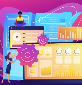
Charts and data visualization have been around for quite some time. However, over the years, technology has improved, and project managers have more options than ever before. Several free and premium tools allow you to create interactive charts as well as an effective project timeline which makes project management easier.
One would think that the people who run organizations that provide data visualization capabilities would be on the rise and used for every project plan, but they are not. This is because a lot of project managers in the business do not even know the true benefits of using interactive charts in managing projects. So, which project management tool is for you?
Here are the top five reasons you should be using interactive charts for project management:
Manageable Information
The basic need of every project manager is complete and full knowledge of the timeline of the project. With interactive charts, the odd bar chart, and other data visualization tools, the information or data sets you are working on become much more manageable.
Interactive charts and data visualization techniques provide a good overview of the progress that has been made on the project. Gantt Charts, for example, provide a quick overlook at what the team should be doing, who has done the work, and how synchronized the team is with the proposed timeline.
It also helps you keep track of the following aspects of the project:
The separate steps needed to complete a particular task
The teams and members involved in completing that task
The time and cost of each task
Once you use the interactive charts to visualize the project’s progress and the team’s performance, you will have a better grip on the project. You will also have a visual overview of the project so you can manage it accordingly.
Increased Team Productivity
Several free and premium online software provides the facility of quick updates on the charts. When you add more tasks and set time limits, the team member is notified of this update through the right management tools.
After all, the key to good project management is good communication. Interactive charts display information publicly to all the team members. It also allows you to dynamically update tasks and assign them.
Doing this helps team members stay on top of their game, as they can also see the tasks assigned and the deadline for each task; this makes the team members hold each other accountable. They are aware of the deadline that has been set and the scope of the task that needs to be completed by that time.
Many interactive charts allow you to mark tasks as “done” or “in progress.” They also allow you to see the start and end date of each job and to whom this task was assigned.
Effective Resource Planning

Resources are the backbone of any project. An effective project manager is one who can effectively carry out all the resource planning that is required for each project. A user-friendly interface along with interactive charts – like Gantt Charts in Microsoft Project – provide an efficient way to deal with resource planning.
With interactive charts, project managers can see the workload assigned to a particular team and how much time they are consuming for that workload. They also allow project managers to see which teams are collaborating and how effective their collaboration is proving to be.
Using this information, project managers can evenly distribute tasks to the teams and members of the organization. This way they do not overburden a particular group of employees with a specific skill set.
With the right software tools, project managers can prioritize tasks to all users and then assign those tasks with high fragility and priority to teams who have much greater capacity and productivity while the lower end of the task management team can be assigned to the rest. Doing this will boost productivity and also save time and money for the company.
Centralized Project Information
Interactive charts and creative data visualization tools offer a centralized platform where all the people working can share their progress and keep checks on others involved.
Suppose two teams are collaborating. The first team needs a specific task to be done by the second team before they can go about their own work. The first team can set a deadline and check the centralized chart to see how much progress they have made.
In case of a delay, the second team can hold them accountable for it. This way, productivity increases as people feel the pressure of individual and collective accountability.
Using such interactive charts also enables you to update yourself on the progress of the project without having to ask the members of a particular team about it continuously.
Clarity and Accountability
Interactive charts are dynamic and receive updates regularly, so everyone involved can see them. Furthermore, it increases accountability among teams. It helps team members involved in a particular task realize that future tasks depend heavily on their current task. As a result, they will increase their productivity levels to stay on track.
These tools also help team members better understand the responsibility on their shoulders. It ultimately provides each team member with a great sense of motivation.
Wrap Up
With interactive charts, project management becomes much more efficient and much less stress-inducing. Project managers can massively benefit from the multiple facilities and advantages these tools provide.
Make sure to use these charts to make project management easier and more reliable for you as well as for the team you are working with.
Popular Tweets
ClickUp vs Jira:
— Growth Hackers (@TopGrowthAgency) January 31, 2024
- Visualize & Plan
- Gantt Chart
- Document Storage
- Native Time Tracking
- To-Do List
- Sprints
- Timeline view
- #Automation
- #Data & Reporting
- Support & Resources
- Pricing
- ...#ProjectManagement #Software #SaaS #TimeManagementhttps://t.co/MidKySJzX7